Showing posts with label watercolor/tablet. Show all posts

Sunday, January 31, 2010

Tree House

Tonight I wanted to experiment, so I did this painting of a tree house. I wanted to try using only a few colors, also wanted to try alcohol splatters on it (I hear it makes the paint go away - didn't have a lot of luck with that), also wanted to try a cartoonish, dreamier style. And one more also, I did a lot of wet on wet, which I normally don't do.

I like the concept of this painting, but not sure it came out how I wanted it to. I didn't sketch it out ahead of time, I just let it go - and I feel that the tree house is what suffered for it. I really like the ground - I used leftover coffee instead of water for painting it. I wish I would have used regular water for the sky, though - it looks dirty now, and it didn't turn out as I wanted it to... (I was hoping the alcohol could look like stars, but it didn't).

Oh well, it is what it is :) I learned what coffee painting is and isn't good for, at least.

regular watercolors

After staring at it and hating it, though, I decided to see what would happen if I played with it in Photoshop like I've done with my landscape paintings. I really wanted to add stars and fix the crazy coloring (which I never intended to be so bright).

watercolor with tablet


So now I have two different versions of this, and I'm not overly happy with either of them!


Friday, January 29, 2010

Mexico City

First, thanks to the people that came to say hello after my mom's shameless plugging.

The Mexico City idea is from The Virtual Paintout challenge. The challenge is old, from a couple weeks ago, before I even joined blogger. But I decided to do it anyway, because I have nothing better to do, and because I am not imaginative enough to think of something to paint on my own.

So I spent most of yesterday on it. It took a while to find a picture of Mexico City that I enjoyed. I wanted one that would show it the way I pictured it in my head. I saved the Google picture this time, something I wish I had done with my Corsica picture, but didn't think of.

I think it came out nice, aside from some smearing/warping in the windows of the nearest building. Those bars over all the windows are kind of tough. Even my rose bush smeared into it slightly, making it pink, but thats all right. Also, there are yet again cars in the photo, but I left them out. And you can see that I stubbornly avoid clouds. No reason to ruin the picture..


Wednesday, January 27, 2010

The Ashcan School


I might have completely misunderstood the concept - "gritty urban scenes" is one phrase the challenge used to describe the art, and my picture is hardly that. The challenge also describes the Ashcan School as a group of artists who wanted to depict real life, and even if its not gritty or urban, hopefully this picture does that much. Because I looked at Robert Henri's art, and I saw many portraits, a few city streets showing the weather, but nothing that really seemed to stand out as a representation of what the Ashcan school was about...

So I did a picture set as America enters World War I (1917 - the U.S. declared war against Germany), and the first soldiers are off to war. It's supposed to be this guy and his wife and kids, but I'm afraid the soldier looks too young, and his wife looks too old (I think it's just her hair style, which I tried to keep accurate for that time period, but it turned out with bits of grey in it...). It almost looks more like a son/big brother than a father :P Oh well.

I also got a little impatient with it, so that my lines can still be seen and are extremely messy in some places (like the little boy, or the soldier's hands). And I didn't mean for that boy's eye to be sooo dark. I had to look up what the soldier uniforms looked like back then and everything, and I tried (and failed) with the lady to do clothes in the right style... by the time I got to the kids, I gave up, obviously. The boy is nearly naked. I'm not as much of a perfectionist as I thought I was :)

I probably won't submit it. I kind of like just doing it for fun and leaving it at that. If I did get the wrong idea from the challenge, its okay, I kind of like the idea of this picture anyway.

(I don't like drawing people. I get their proportions right, but they always look cartoonish.)


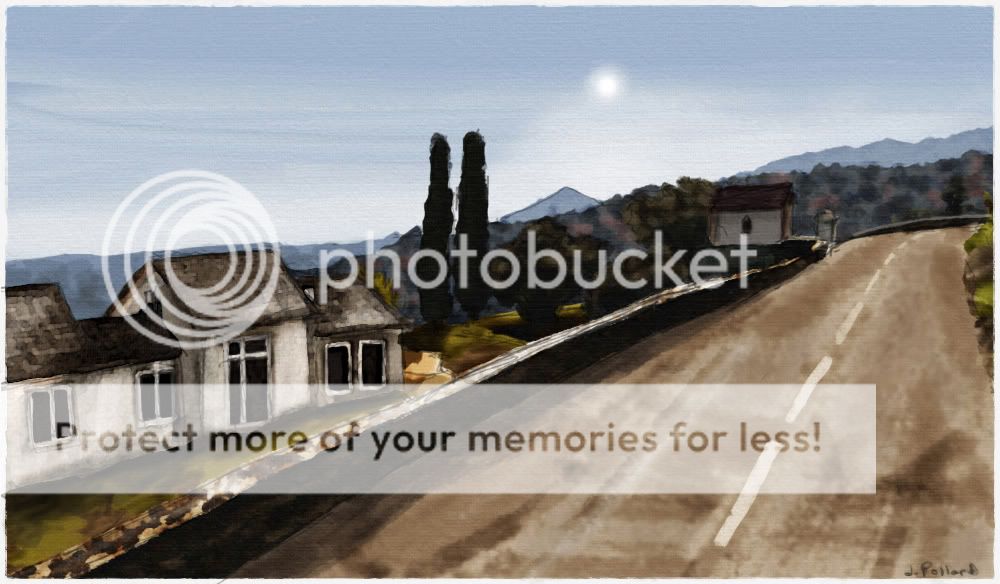
Corsica


Corsica looks like a mighty fine place to live.

I made the following picture for The Virtual Paintout current challenge, but I haven't sent it in yet, and not sure if I'm going to. Anyway, the hills in the background came out surprisingly well, although really, they are just little blobs of color that happened to turn out nicely. And the trees that are closer up, in the yard - I was really happy with those, but they didn't actually look very good until the whole thing was finished. I think it's the shadows on the ground that's making them stand out.

Otherwise, I just wish I'd spent more time on that house. It looks uneven and crooked. The roof was tiled and the way the sun reflected off of it.. that was hopeless. And the stone wall was hard, too.

I can't believe people actually live like this, in views like this one. I wonder who owns that house (I hope they don't ever see this - I bet it'd be weird to randomly come across a painting of your house and street online). There was a minivan parked next to it in the Google map picture, but I decided not to include that.


Related Posts with Thumbnails