Tuesday, February 2, 2010

The Dog Project


I have a plan.

Girl dancing

This was mostly some more experimenting with lights. I have had the idea to paint something like this in my head for several days now, but I thought it deserved more than my watercoloring skills. So for that reason, I used the tablet :)

(I know it seems like I use the tablet a lot, but I get the best results with it.)

I'm still really looking forward to using oils, though. I'm determined that tablet and oil are fairly similar, but I don't really know for sure. It seems like they would be.

I also took many screen shots to show it as a WIP so people can understand how these things come about. This is done with a few different colors, the smudge and blur tools, and the burn and dodge tools. Most of it is taken step by step after every different thing I did, though I didn't bother to show the creation of the background, mainly because I was just making lines and colors to fill blank space.

My only complaint is that I didn't really get the expression I wanted out of her... but she doesn't look bad, regardless. Also (not that it matters), she's sort of slow dancing and waving her arm back and forth hula style. NOT fast crazy dancing or anything. She was supposed to look peaceful, which is why the expression was important!


(it is originally a larger image, but everywhere resizes if it's too big... I am currently searching for someplace to host the original size.)

Something is off with that raised arm and the missing shoulder... but it's done, I'm not going to mess with it!!!

Sunday, January 31, 2010

Tree House

Tonight I wanted to experiment, so I did this painting of a tree house. I wanted to try using only a few colors, also wanted to try alcohol splatters on it (I hear it makes the paint go away - didn't have a lot of luck with that), also wanted to try a cartoonish, dreamier style. And one more also, I did a lot of wet on wet, which I normally don't do.

I like the concept of this painting, but not sure it came out how I wanted it to. I didn't sketch it out ahead of time, I just let it go - and I feel that the tree house is what suffered for it. I really like the ground - I used leftover coffee instead of water for painting it. I wish I would have used regular water for the sky, though - it looks dirty now, and it didn't turn out as I wanted it to... (I was hoping the alcohol could look like stars, but it didn't).

Oh well, it is what it is :) I learned what coffee painting is and isn't good for, at least.

regular watercolors

After staring at it and hating it, though, I decided to see what would happen if I played with it in Photoshop like I've done with my landscape paintings. I really wanted to add stars and fix the crazy coloring (which I never intended to be so bright).

watercolor with tablet


So now I have two different versions of this, and I'm not overly happy with either of them!


Saturday, January 30, 2010

Portrait (some guy)

I've said before that since this blog is new and I missed a lot of art challenges on different blogs, I wanted to try to go back and redo them, even though I can't submit them. This one is for the Different Strokes from Different Folks year end challenge. Obviously, I don't have anyone to swap portraits with at this point, so I just chose a headshot of somebody in a music video I was watching on Youtube. I could have done myself, but I know there's a self portrait challenge also that I'll get to eventually.

I chose this image specifically because it has abnormal coloring and lighting effects.

I did it all on the tablet. Its fast and mess free, and a breeze to correct errors. I haven't used oils yet, but I like to think this is similar to them as far as how you blend colors and shadows. Anyway, I don't think anybody that's been doing these challenges have submitted anything done on a tablet, and I don't know if people even realize what these things can do. The only real downside is that you have nothing tangible... except a print.

Hmm... my art looks so much more confident in this medium compared to in others. But I'm going to try oil painting soon, so that's exciting.


Friday, January 29, 2010

Shading


Wanted to try some simple line shading. I'm afraid I don't have the patience to do it really well, so my lines are more like quick scribbles! But I did get some sloppy cross hatching in.

(By the way, I drew this on a Wacom tablet, which is why some lines are so thick and some aren't, and why you can't see eraser marks everywhere, ha!)

Mexico City

First, thanks to the people that came to say hello after my mom's shameless plugging.

The Mexico City idea is from The Virtual Paintout challenge. The challenge is old, from a couple weeks ago, before I even joined blogger. But I decided to do it anyway, because I have nothing better to do, and because I am not imaginative enough to think of something to paint on my own.

So I spent most of yesterday on it. It took a while to find a picture of Mexico City that I enjoyed. I wanted one that would show it the way I pictured it in my head. I saved the Google picture this time, something I wish I had done with my Corsica picture, but didn't think of.

I think it came out nice, aside from some smearing/warping in the windows of the nearest building. Those bars over all the windows are kind of tough. Even my rose bush smeared into it slightly, making it pink, but thats all right. Also, there are yet again cars in the photo, but I left them out. And you can see that I stubbornly avoid clouds. No reason to ruin the picture..


Wednesday, January 27, 2010

The Ashcan School


I might have completely misunderstood the concept - "gritty urban scenes" is one phrase the challenge used to describe the art, and my picture is hardly that. The challenge also describes the Ashcan School as a group of artists who wanted to depict real life, and even if its not gritty or urban, hopefully this picture does that much. Because I looked at Robert Henri's art, and I saw many portraits, a few city streets showing the weather, but nothing that really seemed to stand out as a representation of what the Ashcan school was about...

So I did a picture set as America enters World War I (1917 - the U.S. declared war against Germany), and the first soldiers are off to war. It's supposed to be this guy and his wife and kids, but I'm afraid the soldier looks too young, and his wife looks too old (I think it's just her hair style, which I tried to keep accurate for that time period, but it turned out with bits of grey in it...). It almost looks more like a son/big brother than a father :P Oh well.

I also got a little impatient with it, so that my lines can still be seen and are extremely messy in some places (like the little boy, or the soldier's hands). And I didn't mean for that boy's eye to be sooo dark. I had to look up what the soldier uniforms looked like back then and everything, and I tried (and failed) with the lady to do clothes in the right style... by the time I got to the kids, I gave up, obviously. The boy is nearly naked. I'm not as much of a perfectionist as I thought I was :)

I probably won't submit it. I kind of like just doing it for fun and leaving it at that. If I did get the wrong idea from the challenge, its okay, I kind of like the idea of this picture anyway.

(I don't like drawing people. I get their proportions right, but they always look cartoonish.)


dog sketch

A few weeks ago, around Christmas, I sketched a picture of my dog, Harley. He loves to sleep on the couch (he's a bum). I had just gone to the bookstore and bought a book on sketching. Apparently, a lot of people draw what they think they see instead of what they really do. The book had several pages dedicated to perspective.

I was sitting on the other end of the couch, with Harley's rear end nearest to me. So I decided to try a perspective drawing. I think his head turned out a tiny bit too big (he does have a big head, really, though). But I like his little nub tail :D More than the dog, however, I was pleased with the couch. I think I accomplished what I was going for with the whole "perspective" thing, and that back cushion nearest -with the stitching- makes me happy.

By the way, Harley is a boxer.


I took a pic of the sketch with the camera because I'm too lazy to bust out the scanner, which is why the lighting (dark corners, and the middle is kind of phased out) is kind of funky. I also had to darken the picture a little because it wasn't showing up well from the camera. It now looks like it darkened every smudge and smear, so that it appears this was done in pastels because the highlights are suddenly so strong. Really, they're just plain paper showing through. Not a bad effect, but not intended.


Corsica


Corsica looks like a mighty fine place to live.

I made the following picture for The Virtual Paintout current challenge, but I haven't sent it in yet, and not sure if I'm going to. Anyway, the hills in the background came out surprisingly well, although really, they are just little blobs of color that happened to turn out nicely. And the trees that are closer up, in the yard - I was really happy with those, but they didn't actually look very good until the whole thing was finished. I think it's the shadows on the ground that's making them stand out.

Otherwise, I just wish I'd spent more time on that house. It looks uneven and crooked. The roof was tiled and the way the sun reflected off of it.. that was hopeless. And the stone wall was hard, too.

I can't believe people actually live like this, in views like this one. I wonder who owns that house (I hope they don't ever see this - I bet it'd be weird to randomly come across a painting of your house and street online). There was a minivan parked next to it in the Google map picture, but I decided not to include that.


An Introduction

My mom participates in a lot of art challenges on here, and every once in a while, she tries to get me to do it, too. Normally, my other interests outweigh my desire to do art... but lately I've gotten into it again. 26 days late, but my I know my New Year's resolution now.

I created a blog for it because my main problem is I have no motivation or idea on what to draw/paint/etc (thus, my blog description above). But here I can respond to ideas issued to others.

I'm not one to comment a lot for other people - I'm not good at giving cc, and I don't enjoy commenting just to say "I like it!" - and I'm not very outgoing or super friendly (but I am very nice!), so I don't expect that I'll receive much in return... Well. Except from my mom, probably. But that's okay with me.

Aside from that, I haven't decided whether I want to submit the art I do to the blogs that issue the challenge or not. I get nervous. I'm happy to just post here, even if nobody sees it but me :)

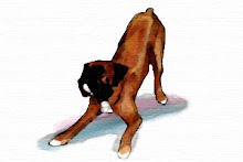
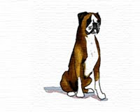
I use mixed medias and try to use vivid colors.


Related Posts with Thumbnails